
christopher lortie - integrative ecologist
The even bigger picture to contemporary scientific syntheses
Background/Question/Methods
Scientific synthesis is a rapidly evolving field of meta-science pivotal to numerous dimensions of the scientific endeavor and to society at large. In science, meta-analyses, systematic reviews, and evidence mapping are powerful explanatory means to aggregate evidence. However, direct compilation of existing primary evidence is also increasingly common to explore the big picture for pattern and process detection and is used to augment more common synthesis tools. Meta-analyses of primary study literature can be combined with open data assets reporting frequency, distribution, and traits of species. Climate, land-use, and other measures of ecosystem-level attributes can also be derived to support literature syntheses. In society, evidence-based decision making is best served through a diversity of synthesis outcomes in addition to meta-analyses and reviews. The hypothesis tested in this meta-science synthesis is that the diversity of tools and evidence to scientific syntheses has changed in contemporary ecology and environmental sciences to more comprehensively reuse and incorporate evidence for knowledge production.
Results/Conclusions
Case studies and a formal examination of the scope and extent of the literature reporting scientific synthesis as the primary focus in the environmental sciences and ecology were done. Topically, nearly 700 studies use scientific synthesis in some capacity in these two fields. Specifically, less than a dozen formally incorporate disparate evidence to connect related concepts. Meta-analyses and formal systematic reviews number at over 5000 publications. Syntheses and aggregations of existing published aggregations are relatively uncommon at less than 10 instances. Reviews, discussions, forums, and notes examining synthesis in these two fields are also frequent at 2500 offerings. Analyses of contemporary subsets of all these publications in the literature identified at least three common themes. Reuse and reproducibility, effect sizes and strength of evidence, and a comprehensive need for linkages to inform decision making. Specific novel tools used to explore derived data for evidence-based decision making in the environmental sciences and ecology included evidence maps, summaries of lessons, identification of flagship studies in the environmental studies that transformed decision making, reporting of sample sizes at many levels that supported effect size calculations, and finally, reporting of a path forward not just for additional research but for application. Collectively, this meta-synthesis of research demonstrated an increasing capacity for diverse scientific syntheses to inform decision making for the environmental sciences.
Steps to update a meta-analysis or systematic review
You completed a systematic review or meta-analysis using a formal workflow. You won the lottery in big-picture thinking and perspective. However, time passes with peer review or change (and most fields are prolific even monthly in publishing to your journal set). You need to update the process. Here is a brief workflow for that process.
Updating a search
- Revisit the same bibliometrics tool initially used such as Scopus or Web Science.
- Record date of current instance and contrast with previous instance documented.
- Repeat queries with exact same terms. Use ‘refine’ function or specific ‘timespan’ to year since last search. For instance, last search for an ongoing synthesis was Sept 2019, and we are revising now in Jan 2020. Typically, I use a fuzzy filter and just do 2019-2020. This will generate some overlap. The R package wosr is an excellent resource to interact with Web of Science in all instances and enables reproducibility. The function ‘query_wos’ is fantastic, and you can specify timespan using the argument PY = (2019-2020).
- Use a resource that reproducibly enables matching to explore overlaps from first set of studies examined to current updated search. I use the R-package Bibliometrix function ‘duplicatedMatching’, and if there is uncertainty, I then manually check via DOI matching using R code.
- Once you have generated your setdiff, examine new entries, collect data, and update both meta-data and primary dataframes.
Implications
- Science is rapid, evolving, and upwards of 1200 publications per month are published in some disciplines.
- Consider adding a search date to your dataframe. It would be informative to examine the rate that one can update synthesis research.
- Repeat formal syntheses, and test whether outcomes are robust.
- Examine cumulative meta-analytical statistics.
- Ensure your code/workflow for synthesis is resilient to change and replicable through time – you never know how long reviews will take if you are trying to publish your synthesis.
Vision statement for Ecological Applications
Philosophy. Know better, do better.
Applied science has an obligation to engender social good. These pathways can include knowledge mobilization, mode-2 scientific production, transparency, addressing the reproducibility crisis in science, promoting diversity and equity through representation, and enabling discovery through both theory and application of ecological principles. Evidence-based decision making can leverage the work published in Ecological Applications. However, evidence-informed decision making that uses ecological principles and preliminary evidence as a means to springboard ideas and more rapidly respond to global challenges are also needed. Science is not static, and the frame-rate of changes and challenges is exceptionally rapid. We cannot always (ever) afford to wait for sufficient, deep evidence, and in ecological applications, we need to share what clearly works, what can work, and finally also what did not work. This is a novel paradigm for publishing in a traditional journal. We are positioned with innovations in ecology such as more affordable sensor technology, R, citizen science, novel big data streams from the Earth Sciences, and team science to provide insight-level data and update data and findings over time. An applied journal need not become full open access or all open science practice based (although we must strive for these ideals), but instead provide at least some capacity within the journal to interact with policy, decision processes, and dialogue to promote the work published and to advance societal knowledge.
Proposed goals: content
- Leverage the ‘communications’ category of publications to hone insights in the field and advance insights that are currently data limited.
- Invite stakeholders and policy practioners to more significantly contribute to communications reacting and responding to evidence and highlighting evidence (similar to the ‘letters to the editor’) from a constructive and needs-based perspective.
- Provide the capacity for authors of article publications to update contributions with a new category of paper entitled ‘application updates’.
- Look to other applied science journals such as Cell for insights. This journal for instance includes reviews, perspectives, and primers as contributions. It also has a strong thematic and special issue focus to organize content.
- In addition to an Abstract, further develop the public text box model to describe highlights, challenges, and next steps for every article.
- Expand the breadth of the ‘open research’ section of contributions to include code, workflows, field methods, photographs, or any other research product that enables reproducibility.
- Explore a mechanism to share applications that were unsuccessful or emerging but not soundly confirmed.
- Explore a new ‘short synthesis’ contribution format that examines aggregated evidence. This can include short-format reviews, meta-analyses, systematic reviews, evidence maps, description of new evidence sets that support ecological applications or policy, and descriptions of compiled qualitative evidence for a contempoary challenge.
Proposed goals: process
- Accelerate handling time (currently, peer-review process suggests three weeks for referees). Reduce editor review time to 2 weeks and referee turnaround time to 2 weeks.
- Remove formatting requirements for initial submission.
- Remove cover letter requirement. Instead, include a short form in ScholarOne submission system that provides three brief fields to propose implications wherein the authors propose why a specific contribution is a good fit for this journal.
- Allow submission of a single review solicited by the authors. This review must be signed and does not count toward journal review process but can be a brilliant mechanism to inform editor-level review.
- Data must be made available at the time of submission. This can be a private link to data or published in a repository with limited access until acceptance. It is so useful to be able to ‘see’ data, literally, in table format to understand how and what was interpreted and presented.
- Consider double-blind review.
- Develop more anchors or hooks in papers that can reused and leveraged for policy. This can include specific reporting requirements such as plot/high-level sample sizes (N), total sample sizes of subjects (n), clear reporting of variance, and where possible, an effect size metric even as simple as the net percent change of the primary intervention or application.
- The current offerings are designated by contribution type such as article, letter, etc. However, once viewing a paper, the reader must best-guess based on title, abstract, and keywords how this paper contributes to application. A system of simple badges that visually signals to readers and those these seek to reuse content what a paper addresses. These badges can be placed above the title alongside the access and licensing designation badges. Categories of badges can include an icon for biome/ecosystem, methods, R or code used, immediately actionable, mode-2 collaboration, and theory.
- Expand SME board further. Consider accept without review as mechanism to fast track contributions that are critical and the most relevant. This would include an editor-only exceptionally rapid review process.
- Engage with ESA, other journals, and community to develop and offer more needs-driven special issues.

Landscapes are changing and people are always part of the picture.
Science is an important way of knowing and interacting with natural systems.

Not everything needs fixing, see https://www.pleine-lune.org
steps to update a manuscript that was hung up in peer review forever then rejected (or just neglected for a long time)
Sometimes, peer review (and procrastination) help. Other times, the delays generate more net work. I was discussing this workflow with a colleague regarding a paper that was submitted two-years ago, rejected, then we both ran out of steam. This was the gold-standard workflow we proposed (versus reformat and submit to another journal immediately).
Workflow
- Hit web of science and check for new papers on topic.
- Download the pdfs.
- Read them.
- Think about what to cite or add.
- Add citations and rebuild biblio.
- Update writing to mention new citations especially if they are really relevant (intro and discussion).
- Take whatever pearls of wisdom you can from rejection in first place and revise ideas, plots, or stats.
- Format for new journal.
- Check requirements for that journal.
- Search the table of contents for the journal and check your lit cited to ensure you cite a few papers from that journal – if not, assess whether that the right journal for this contribution.
- Download pdfs from new journal, read, cite, and interpret.
- Then, look up referees and emails.
- Write cover letter.
- Set up account for that new and different annoying journal system – register and wait.
- Fight with system to submit and complete all the little boxes/fields.
Prepping data for rstats tidyverse and a priori planning
messy data can be your friend (or frenemy)
Many if not most data clean up, tidying, wrangling, and joining can be done directly in R. There are many advantages to this approach – i.e. read in data in whatever format (from excel to json to zip) and then do your tidying – including transparency, a record of what you did, reproducibility (if you ever have to do it again for another experiment or someone else does), and reproducibility again if your data get updated and you must rinse and repeat! Additionally, an all-R workflow forces you to think about your data structure, the class of each vector (or what each variable means/represents), missing data, and facilitates better QA/QC. Finally, your data assets are then ready to go for the #tidyverse once read in for joining, mutating in derived variables, or reshaping. That said, I propose that good thinking precedes good rstats. For me, this ripples backwards from projects where I did not think ahead sufficiently and certainly got the job done with R and the tidyverse in particular, but it took some time that could have been better spent on the statistical models later in the workflow. Consequently, here are some recent tips I have been thinking about this season of data collection and experimental design that are pre-R for R and how I know I like to subsequently join and tidy.
Tips
- Keep related data in separate csv files.
For instance, I have a site with 30 long-term shrubs that I measure morphology and growth, interactions with/associations with the plant and animal community, and microclimate. I keep each set of data in a separate csv (no formatting, keeps it simple, reads in well) including shrub_morphology.csv, associations.csv, and microclimate.csv. This matches how I collect the data in the field, represents the levels of thinking and sampling, and at times I sample asynchronously so open each only as needed. You can have a single excel file instead with multiple sheets and read those in using R, but I find that there is a tendency for things to get lost, and it is hard for me to have parallel checking with sheets versus just opening up each file side-by-side and doing some thinking. Plus, this format ensures and reminds me to write a meta-data file for each data stream. - Always have a key vector in each data file that represents the unique sampling instance.
I like the #tidyverse dyplr::join family to put together my different data files. Here is an explanation of the workflow. So, in the shrub example, the 30 individual shrubs structure all observations for how much they grow, what other plants and animals associate with them, and what the microclimate looks like under their canopy so I have a vector entitled shrub_ID that demarcates each instance in space that I sample. I often also have a fourth data file for field sampling that is descriptive using the same unique ID as the key approach wherein I add lat, long, qualitative observations, disturbances, or other supporting data. - Ensure each vector/column is a single class.
You can resolve this issue later, but I prefer to keep each vector a single class, i.e. all numeric, all character, or all date and time. - Double-code confusing vectors for simplicity and error checking.
I double-code data and time vectors to simpler vectors just to be safe. I try to use readr functions like read_csv that makes minimal and more often than not correct assumptions about the class of each vector. However, to be safe for vectors that I have struggled with in the past, and fixed in R using tidytools or others, I now just set up secondary columns that match my experimental design and sampling. If I visit my site with 30 shrubs three times in a growing season, I have a date vector that captures this rich and accurate sampling process, i.e. august 14, 2019 as a row, but I also prefer a census column that for each row has 1,2, or 3. This helps me recall how often I sampled when I reinspect the data and also provides a means for quick tallies and other tools. Sometimes, if I know it is long-term data over many years, I also add a simple year column that simply lists 2017, 2018, and 2019. Yes, I can reverse engineer this in R, but I like the structure – like a backbone or scaffold to my dataframe to support my thinking about statistics to match design. - Keep track of total unique observation instances.
I like tidy data. In each dataframe, I like a vector that provides me a total tally of the length of the data as a representation of unique observations. You can wrangle in later, and this vector does not replace the unique ID key vector at all. In planning an experiment, I do some math. One site, 30 shrubs, 3 census events per season/year, and a total of 3 years. So, 1 x 30 x 3 x 3 should be 270 unique observations or rows. I hardcode that into the data to ensure that I did not miss or forget to collect data. It is also fulfilling to have them all checked off. The double-check using tibble::rowid_to_column should confirm that count, and further to tip #2, you can have a variable or set of variables to join different dataframes so this becomes fundamentally useful if I measured shrub growth and climate three times each year for three years in my join (i.e. I now have a single observation_ID vector I generated that should match my hardcoded collection_ID data column and I can ensure it lines up with the census column too etc per year). A tiny bit of rendundancy just makes it so much easier to check for missing data later. - Leave blanks blank. Ensures your data codes true and false zeros correctly (for me this means I observed a zero, i.e. no plants under the shrub at all versus missing data) and also stick to tip #3. My quick a priori rule that I annotate in meta-data for each file is that missing altogether is coded as blank (i.e. no entry in that row/instance but I still have the unique_ID and row there as placeholder) and an observed zero in the field or during experiment is coded as 0. Do not record ‘NA’ as characters in a numeric column in the csv because it flips the entire vector to character, and read_csv and other functions sorts this out better with blanks anyway. I can also impute in missing values if needed by leaving blanks blank.
- Never delete data. Further to tip #1, and other ideas described in R for Data Science, once I plan my experiment and decide on my data collecting and structural rules a priori, the data are sacred and stay intact. I have many colleagues delete data that they did not ‘need’ once they derived their site-level climate estimates (then lived to regret it) or delete rows because they are blank (not omit in #rstats workflow but opened up data file and deleted). Sensu tip #5, I like the tally that matches the designed plan for experiment and prefer to preserve the data structure.
- Avoid automatic factor assignments. Further to simple data formats like tip #1 and tip #4, I prefer to read in data and keep assumptions minimal until I am ready to build my models. Many packages and statistical tools do not need the vector be factor class, and I prefer to make assignments directly to ensure statistics match the planned design for the purpose of each variable. Sometimes, variables can be both. The growth of the shrub in my example is a response to the growing season and climate in some models but a predictor in other models such as the effect of the shrub canopy on the other plants and animals. The r-package forcats can help you out when you need to enter into these decisions and challenges with levels within factors.
Putting the different pieces together in science and data science is important. The construction of each project element including the design of experiment, evidence and data collection, and #rstats workflow for data wrangling, viz, and statistical models suggest that a little thinking beforehand and planning (like visual lego instruction guides) ensures that all these different pieces fit together in the process of project building and writing. Design them so that connect easily.
Sometimes you can get away without instructions and that is fun, but jamming pieces together that do not really fit and trying to pry them apart later is never really fun.
fieldwork takes practice: lost quadrat and zenmind
Fieldwork takes practice.
I love this pic because the landscape is so spectacular (Cuyama Valley, here is the post on the work our team is doing there), and it ‘looks’ like I am working. A new research associate has joined the team. Chase and I were out in the Cuyama Valley and Carrizo National Monument. I was hoping to share with him some wisdom, hang out, survey some plots, and check on everything. The best thing about this pic however is that I am missing my quadrat (and my wisdom). I am looking back to Chase for about the tenth time hoping he picked up mine in addition to his own.
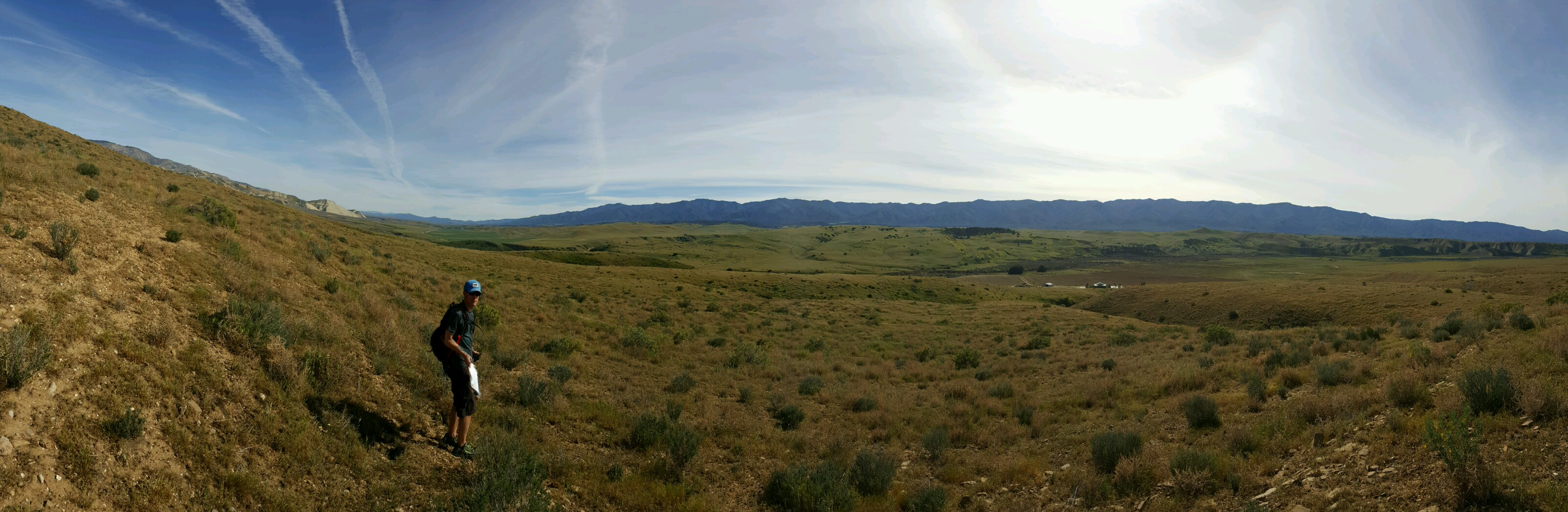
I never had to pick up his quadrat.
I also managed to lead us down the wrong dirt road once (only 12 miles), and in another instance, I was positive that this particular slope was the correct one and we ended up on a very pretty but extended detour.
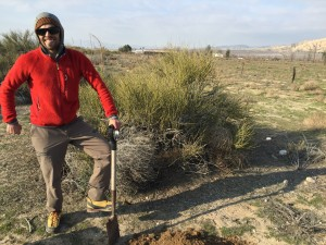
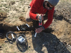
Cuyama Valley Micronet project
With SB county, California, global change will certainly impact coastal zones. However, dryland ecosystems will also be subject to significant change. To examine the importance of shrubs as a buffer to some of these processes, we are deploying a micro-environmental network to measure the amplitude of several key processes. It turned out to be a real gem of a study site.
So much beauty just over the hill away from the roads.

Big Data for Little Schools
University libraries are increasingly becoming repositories not just for books but for data. Data are diverse including numbers, text, imagery, videos, and the associated meta-data. Long-term ecological and environmental data are also important forms of evidence for change, a critical substrate for scientific synthesis, and an opportunity to align methodologies and research efforts nationally and globally (i.e. LTER). Any school library can participate in this process now with the capacity for distributed cloud storage, the internet of things, and very affordable microenvironmental sensors placed in ecologically meaningful contexts.
Source: Ignite talk on big data in ecology.
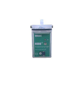
In collecting ecological data about a place, we assign cultural value (it is worthwhile measuring now and for a long time), and we develop a more refined and permanent sense of attachment to this place. Increased engagement by local individuals within the immediate community is an important first step in promoting ecological education, breaking down the barriers between traditional and citizen science, and producing meaningful big data on the environment and ecology of place. Consequently, school libraries, at least the elementary level, can engage with big data in ecology. In the ecology course course I teach to second-year university students, we use flower power sensors to measure soil moisture, temperature, light, and soil nutrient levels. These sensors are very affordable, have an excellent dashboard, and bluetooth sync with iOS devices. However, the big data are only server side and need to be extracted using an app from the dashboard data visualizations. Onset also produces the pendant loggers that measure light and temperature. These sensors log and store data as well but are not bluetooth enabled. You must plug them into an optical sensor but then can download all the data your computer. We use both sensors in this ecology course and deploy them on our university campus. Elementary schools could absolutely do the same for a nominal investment and engage children with microenvironmental datasets that can be linked to their school gardens, flower patches, or any other habitats within the campus. We have a profound opportunity to teach big data, ecology, experimental design, and awareness of place.

Proposal
- Work with elementary school librarian to set up/select appropriate data repository.
- Develop a short curriculum with learning materials for teachers on open data, publishing data, meta-data, and micro-instrumentation to measure meaningful attributes associated with the ecology of a campus.
- Discuss open science and highlight urban ecology research to date.
- Purchase a set of a dozen sensors to deploy on the school campus.
- Students work with the librarian to download the data regularly, describe the data, and publish is regularly on a data repository. The students publish the data.
- The library highlights and hosts the visualizations associated with these data and archives the photographs, descriptions of the methods, and videos from students.
Outcomes/products
- A school protocol for measures the dynamics of the natural environment on campus.
- Real-time or aggregated descriptions of the ecology of the campus (descriptions of the flower gardens, vegetable gardens, or any greenspace).
- Datasets in public repositories.
- Imagery/videos of the greenspaces linked to big data also provided by the students.
- Data management training and experience within the library context for elementary students.
- Consider including or working with basic r-code to do statistics or visualizations.

A legal workaround idea for non openaccess ecology articles – university library #openpaper outreach days
Context
The access paywall of many scientific journals is a significant barrier to a rapid, efficient process of securing many peer-reviewed ecology and science articles. Recently, I needed to assess the state-of-the-art for animal camera trapping in wildlife ecology. I used google scholar and web of science to populate a list of papers to read. I was ‘behind the paywall’ at a university IP address. Even with this barrier removed, it was a challenge. I wanted to pull down a total of 20 papers, and only 60% of these were readily available because even with the exorbitant subscription fees the university library pays, some journals were not included. I realized that few wildlife ecologists and managers have even the limited level of access that I had to these very applied papers. This is a problem if we want evidence-based conservation and management of natural systems to prevail. There are numerous solutions of course including contacting the authors directly, searching for it online and hoping you get lucky to find it posted somewhere, checking researchgate, and joining a few other similar access author-based portals. There are two other simple solutions of course to engage managers – share with them directly when it is in print and encourage them to join a service like researchgate. Identifying managers interested in our work and sending it to them is a form of scientific communication and outreach. We need to do it. However, I had an even more broad public outreach idea – use university libraries as public access research portals.
University libraries pay subscription fees to many publishers. Leverage this access to run open science or open paper days. In my experience, even with a temporary guest ID on wifi at most university campuses, one is able to access their full offerings of peer-reviewed publications. Universities could use this access and do even more – educate on peer review and show off all the incredible research that more often than not taxpayer dollars fund.
University-library solutions
- DayUse Research-IDs. University libraries are increasingly digital repositories of information. Show this off to the public, the parents, and local applied researchers by offering guest-research IDs for a day at time for the public to browse holdings.
- Notifications for digital research content. University libraries are increasing more like digital cafes than physical holdings of books. Advertise the resources that are available behind this paywall to all users, regularly, when they are online. Notifications/alerts, additional linking to primary research from courses and less on textbooks, and potential (non-obtrusive) pop-ups within the network for students on new research developments.
- Open-paper public days. University libraries should run access days to teach the public about modern bibliometric search tools, explain the peer-review process, explain the publishing process, and show/allow folks to look up primary research that interests them. There will always be a topic someone needs to know about and a journal for it. Most importantly, these days will promote scientific literacy and also potentially provide fuel to new pay models or even better different profit models for academic publishers. If non-academics that pay taxes fully comprehended how much awesome research is out there in this academic stream that they never get to see, access, and pay for through tax dollars, it is hard not to imagine they would not want to see big changes.
The function of a university library
More often that not university libraries instead look like massive digital cafes or computer labs.
The problem with all the information in the ether and behind these paywalls is that this intangibility hides the depth of the resource and extent that information could and should be available more broadly. I love the ‘learnings common’ philosophy that is evolving in many university libraries. I am just concerned that it is not reaching far enough out – at least to the parents of the students that attend the university.
University library websites have improved dramatically and feel more contemporary. However, there is a limited signal of the extent of the digital research that are held and no indication of how the public might access even a tiny bit of this infrequently to learn. I recognize public libraries and university libraries are not quite the same thing, but why do they have to be so different. Can they partner, co-evolve, and reduce the paywall limitation to the research that matters for better decisions at least for health and the environment?
My best guess is that university libraries thus provide three significant functions in this domain.
- Provide access to research.
- Provide a space to access and do research.
- Train and educate on how to do research.
As a researcher, the first is the most critical to me. As an educator, all three are important to my students.
Addendum
I recognize all of this misses the point – research should be open. Primary researchers should strive to be OA all the time with our work, but I recognize that there are reasons why we can not necessarily achieve this goal quite yet. Journals can also work towards this end too.
In interim, much of research needed to make the best possible decisions is out there now – i.e. where and how to deploy animal cameras for conservation this field season for my team – and the natural now is changing rapidly.
I want science to help. To do so, we need to be able to see it. Now.
Why read a book review when you you can read the book (for free via oa openscience)?
Reviews, recommendations, and ratings are an important component of contemporary online consumption. Rotten Tomatoes, Metacritic, and Amazon.com reviews and recommendations increasingly shape decisions. Science and technical books are no exception. Increasingly, I have checked reviews for a technical book on a purchasing site even before I downloaded the free book. Too much information, not too little informs many of the competing learning opportunities (#rstats ) for instance). I used to check the book reviews section in journals and enjoyed reading them (even if I never read the book). My reading habits have changed now, and I rarely read sections from journals and focus only on target papers. This is an unfortunate. I recognize that reviews are important for many science and technical products (not just for books but packages, tools, and approaches). Here is my brief listicle for why reviews are important for science books and tools.
benefit description
curation Reviews (reviewed) and published in journals engender trust and weight critique to some extent.
developments and rate of change A book review typically frames the topic and offering of a book/tool in the progress of the science.
deeper dive into topic The review usually speaks to a specific audience and helps one decide on fit with needs.
highlights The strengths and limitations of offering are described and can point out pitfalls.
insights and implications Sometimes the implications and meaning of a book or tool is not described directly. Reviews can provide.
independent comment Critics are infamous. In science, the opportunity to offer praise is uncommon and reviews can provide balance.
fits offering into specific scientific subdiscpline Technical books can get lost bceause of the silo effect in the sciences. Reviews can connect disciplines.
Here is an estimate of the frequency of publication of book reviews in some of the journals I read regularly.
journal total.reviews recent
American Naturalist 12967 9
Conservation Biology 1327 74
Journal of Applied Ecology 270 28
Journal of Ecology 182 0
Methods in Ecology & Evolution 81 19
Oikos 211 22
A good novel tells us the truth about its hero; but a bad novel tells us the truth about its author. –Gilbert K. Chesterton
Politics versus ecological and environmental research: invitation to submit to Ideas in Ecology and Evolution
Dear Colleagues,
Ideas in Ecology and Evolution would like to invite you to submit to a special issue entitled
‘Politics versus ecological and environmental research.’
The contemporary political climate has dramatically changed in some nations. Global change marches on, and changes within each and every country influence everyone. We need to march too and can do so in many ways. There has been extensive social media discussion and political activity within the scientific community. One particularly compelling discussion is best captured by this paraphrased exchange.
“Keep politics out of my science feeds.”
“I will keep politics out of my science when politics keeps out of science.”
The latter context has never existed, but the extent of intervention, falsification by non-scientists, blatant non-truths, and threat to science have never been greater in contemporary ecology and environmental science in particular.
Ideas in Ecology and Evolution is an open-access journal. We view the niche of this journal as a home for topics that need discussing for our discipline. Ideas are a beautiful opportunity sometimes lost by the file-drawer problem, and this journal welcomes papers without data to propose new ideas and critically comment on issues relevant to our field both directly and indirectly. Lonnie Aarssen and I are keen to capture some of the ongoing discussion and #resist efforts by our peers. We will rapidly secure two reviews for your contributions to get ideas into print now.
We welcome submissions that address any aspect of politics and ecology and the environment. The papers can include any of (but not limited to) the following formats: commentaries, solution sets, critiques, novel mindsets, strategies to better link ecology/environmental science to political discourse, analyses of political interventions, summaries of developments, and mini-reviews that highlight ecological/environmental science that clearly support an alternative decision.
Please submit contributions using the Open Journal System site here.
Warm regards,
Chris Lortie and Lonnie Aarssen.
A rule-of-thumb for chi-squared tests in systematic reviews
Rule
A chi-squared test with few observations is not a super powerful statistical test (note, apparently termed both chi-square and chi-squared test depending on the discipline and source). Nonetheless, this test useful in systematic reviews to confirm whether observed patterns in the frequency of study of a particular dimension for a topic are statistically different (at least according to about 4/10 referees I have encountered). Not as a vote-counting tool but as a means for the referees and readers of the review to assess whether the counts of approaches, places, species, or some measure used in set of primary studies differed. The mistaken rule-of-thumb is that <5 counts per cell violates the assumptions of chi-squared test. However, this intriguing post reminds that it is not the observed value but the expected value that must be at least 5 (blog post on topic and statistical article describing assumption). I propose that this a reasonable and logical rule-of-thumb for some forms of scientific synthesis such as systematic reviews exploring patterns of research within a set of studies – not the strength of evidence or effect sizes.
An appropriate rule-of-thumb for when you should report a chi-squared test statistic in a systematic review is thus as follows.
When doing a systematic review that includes quantitative summaries of frequencies of various study dimensions, the total sample size of studies summarized (dividend) divided by the potential number of differences in the specific level tested (divisor) should be at least 5 (quotient). You are simply calculating whether the expected values can even reach 5 given your set of studies and the categorical analysis of the frequency of a specific study dimension for the study set applied during your review process.
total number of studies/number of levels contrasted for specific study set dimension >= 5
[In R, I used nrow(main dataframe)/nrow(frequency dataframe for dimension); however, it was a bit clunky. You could use the ‘length’ function or write a new function and use a ‘for loop’ for all factors you are likely to test].
Statistical assumptions aside, it is also reasonable to propose that a practical rule-of-thumb for literature syntheses (systematic reviews and meta-analyses) requires at least 5 studies completed that test each specific level of the factor or attribute summarized.
Example
For example, my colleagues and I were recently doing a systematic review that captured a total of 49 independent primary studies (GitHub repo). We wanted to report frequencies that the specific topic differed in how it was tested by the specific hypothesis (as listed by primary authors), and there were a total of 7 different hypotheses tested within this set of studies. The division rule-of-thumb for statistical reporting in a review was applied, 49/7 = 7, so we elected to report a chi-squared test in the Results of the manuscript. Other interesting dimensions of study for the topic had many more levels such as country of study or taxa and violated this rule. In these instances, we simply reported the frequencies in the Results that these aspects were studied without supporting statistics (or we used much simpler classification strategies). A systematic review is a form of formalized synthesis in ecology, and these syntheses typically do not include effect size measure estimates in ecology (other disciplines use the term systematic review interchangeably with meta-analysis, we do not do so in ecology). For these more descriptive review formats, this rule seems appropriate for describing differences in the synthesis of a set studies topologically, i.e. summarizing information about the set of studies, like the meta-data of the data but not the primary data (here is the GitHub repo we used for the specific systematic review that lead to this rule for our team). This fuzzy rule lead to a more interesting general insight. An overly detailed approach to the synthesis of a set of studies likely defeats the purpose of the synthesis.
Tips for rapid scientific recordings
Preamble
If a picture is worth a thousand words, a video is worth 1.8 million words. Like all great summary statistics, this has been discussed and challenged (Huffington Post supporting this idea and a nice comment at Replay Science reminding the public it is really a figure of speech).
Nonetheless, short scientific recordings, posted online are an excellent mechanism to put a face to a name, share your inspirations in science, and provide the public with a sense of connection to scientists. It is a reminder that people do science and that we care. I love short videos that provide the viewer with insights not immediately evident in the scientific product. Video abstracts with slide decks are increasingly common. I really enjoy them. However, sometimes I do not get to see what the person looks like (only the slide deck is shown) or how they are reacting/emoting when they discuss their science. Typically, we are not provided with a sense why they did the science or why they care. I think short videos that share a personal but professional scientific perspective that supplements the product is really important. I can read the paper, but if clarifications, insights, implications, or personal challenges in doing the research were important, it would be great to hear about them.
In that spirit, here are some brief suggestions for rapid scientific communications using recordings.
Tips
Tips
Keep the duration at less than 2 minutes. We can all see the slider at the bottom with time remaining, and if I begin to disconnect, I check it and decide whether I want to continue. If it is <2mins, I often persist.
Use a webcam that supports HD.
Position the webcam above you facing down. This makes for a better angle and encourages you to look up.
Ensure that you are not backlit. These light angles generally lead to a darker face that makes it difficult for the viewer to see any expressions at all.
Viewers will tolerate relatively poor video quality but not audio. Do a 15 second audio test to ensure that at moderate playback volumes you can be clearly understood.
Limit your message to three short blocks of information. I propose the following three blocks for most short recordings. (i) Introduce yourself and the topic. (ii) State why you did it and why you are inspired by this research. (iii) State the implications of the research or activity. This is not always evident in a scientific paper for instance (or framed in a more technical style), and in this more conversational context, you take advantage of natural language to promote the desired outcome.
Prep a list of questions to guide your conversation. Typically, I write up 5-7 questions that I suspect the audience might like to see addressed with the associated product/activity.
Do not use a script or visual aids. This is your super short elevator pitch. Connect with the audience and look into the camera.
Have a very small window with the recording on screen, near the webcam position, to gently self-monitor your movement, twitches, and gestures. I find this little trick also forces me to look up near the webcam.
Post online and use social media to effectively frame why you did the recordings. Amplify the signal and use a short comment (both in the YouTube/Vimeo field) and with the social media post very lightly promoting the video.
Happy rapid recording!
Elements of a successful openscience rstats workshop
What makes an open science workshop effective or successful*?
Over the last 15 years, I have had the good fortune to participate in workshops as a student and sometimes as an instructor. Consistently, there were beneficial discovery experiences, and at times, some of the processes highlighted have been transformative. Last year, I had the good fortune to participate in Software Carpentry at UCSB and Software Carpentry at YorkU, and in the past, attend (in part) workshops such as Open Science for Synthesis. Several of us are now deciding what to attend as students in 2017. I have been wondering about the potential efficacy of the workshop model and why it seems that they are so relatively effective. I propose that the answer is expectations. Here is a set of brief lists of observations from workshops that lead me to this conclusion.
*Note: I define a workshop as effective or successful when it provides me with something practical that I did not have before the workshop. Practical outcomes can include tools, ideas, workflows, insights, or novel viewpoints from discussion. Anything that helps me do better open science. Efficacy for me is relative to learning by myself (i.e. through reading, watching webinars, or stuggling with code or data), asking for help from others, taking an online course (that I always give up on), or attending a scientific conference.
Delivery elements of an open science training workshop
- Lectures
- Tutorials
- Demonstrations
- Q & A sessions
- Hands-on exercises
- Webinars or group-viewing recorded vignettes.
Summary expectations from this list: a workshop will offer me content in more than one way unlike a more traditional course offering. I can ask questions right there on the spot about content and get an answer.
Content elements of an open science training workshop
- Data and code
- Slide decks
- Advanced discussion
- Experts that can address basic and advanced queries
- A curated list of additional resources
- Opinions from the experts on the ‘best’ way to do something
- A list of problems or questions that need to addressed or solved both routinely and in specific contexts when doing science
- A toolkit in some form associated with the specific focus of the workshop.
Summary of expectations from this list: the best, most useful content is curated. It is contemporary, and it would be a challenge for me to find out this on my own.
Pedagogical elements of an open science training workshop
- Organized to reflect authentic challenges (https://www.broyeurs-vegetaux.com)
- Uses problem-based learning
- Content is very contemporary
- Very light on lecture and heavy on practical application
- Reasonably small groups
- Will include team science and networks to learn and solve problems
- Short duration, high intensity
- Will use an open science tool for discussion and collective note taking
- Will be organized by major concepts such as data & meta-data, workflows, code, data repositories OR will be organized around a central problem or theme, and we will work together through the steps to solve a problem
- There will be a specific, quantifiable outcome for the participants (i.e. we will learn how to do or use a specific set of tools for future work).
Summary of expectations from this list: the training and learning experience will emulate a scientific working group that has convened to solve a problem. In this case, how can we all get better at doing a certain set of scientific activities versus can a group aggregate and summarize a global alpine dataset for instance. These collaborative solving-models need not be exclusive.
Higher-order expectations that summarize all these open science workshop elements
- Experts, curated content, and contemporary tools.
- Everyone is focussed exclusively on the workshop, i.e. we all try to put our lives on hold to teach and learn together rapidly for a short time.
- Experiences are authentic and focus on problem solving.
- I will have to work trying things, but the slope of the learning curve/climb will be mediated by the workshop process.
- There will be some, but not too much, lecturing to give me the big picture highlights of why I need to know/use a specific concept or tool.
The revolution will not be televised: the end of papers & the rise of data.

I had the good fortune to attend the Datacite Annual Conference this year about giving value to data. Thomson Reuters presented their new Data Citation Index that I had previously explored only cursorily for my ESA annual meeting ignite presentation on data citations. However, after the presentation by Thomson Reuters and the Q&A, I realized that a truly profound moment is upon us – the opportunity to FULLY & independently give value to data within the current framework of merit recognition (i.e. I love altmetrics and we need them too, but we can make a huge change right now with a few simple steps).
The following attributes of the process are what you need to know to fully appreciate the value of the new index: the data citation index is partnering with Datacite to ensure that they capture citations to datasets in repositories with doi’s, citations from papers to datasets are weighted equally to paper-paper citations, and (in the partnership with Datacite) citations from one dataset to another dataset will also be captured and weighted equally. Unless I misunderstood the answers provided by Thomson Reuters, this is absolutely amazing.
Disclaimer: As I mentioned in my ignite presentation, citations are not everything and only one of many estimates of use/reuse. However, we can leverage and link citations to other measures and products to make a change now.
Summary
If we publish our data in repositories, with or without them being linked to papers, we can now provide the recognition needed to data as independent evidence products. Importantly, if you use other datasets to build your dataset such as a derived dataset for a synthesis activity such as a meta-analysis or if you aggregate data from other datasets, cite those data sources in your meta-data. The data citation index will capture these citations too. This will profoundly reshape the publication pipeline we are now stuck in and further fuel the open science movement.
Consequently, publish your datasets now (no excuses) and cite the data sources you used to build both your papers and your datasets. Open science and discovery await.
A note on AIC scores for quasi-families in rstats
A summary note on recent set of #rstats discoveries in estimating AIC scores to better understand a quasipoisson family in GLMS relative to treating data as poisson.
Conceptual GLM workflow rules/guidelines
- Data are best untransformed. Fit better model to data.
- Select your data structure to match purpose with statistical model.
- Use logic and understanding of data not AIC scores to select best model.
(1) Typically, the power and flexibility of GLMs in R (even with base R) get most of the work done for the ecological data we work with within the research team. We prefer to leave data untransformed and simple when possible and use the family or offset arguments within GLMs to address data issues.
(2) Data structure is a new concept to us. We have come to appreciate that there are both individual and population-level queries associated with many of the datasets we have collected. For our purposes, data structure is defined as the level that the dplyr::group_by to tally or count frequencies is applied. If the ecological purpose of the experiment was defined as the population response to a treatment for instance, the population becomes the sample unit – not the individual organism – and summarised as such. It is critical to match the structure of data wrangled to the purpose of the experiment to be able to fit appropriate models. Higher-order data structures can reduce the likelihood of nested, oversampled, or pseudoreplicated model fitting.
(3) Know thy data and experiment. It is easy to get lost in model fitting and dive deep into unduly complex models. There are tools before model fitting that can prime you for better, more elegant model fits.
Workflow
- Wrangle then data viz.
- Library(fitdistrplus) to explore distributions.
- Select data structure.
- Fit models.
Now, specific to topic of AIC scores for quasi-family field studies.
We recently selected quasipoisson for the family to model frequency and count data (for individual-data structures). This addressed overdispersion issues within the data. AIC scores are best used for understanding prediction not description, and logic and exploration of distributions, CDF plots, and examination of the deviance (i.e. not be more than double the degrees of freedom) framed the data and model contexts. To contrast poisson to quasipoisson for prediction, i.e. would the animals respond differently to the treatments/factors within the experiment, we used the following #rstats solutions.
#Functions####
#deviance calc
dfun <- function(object) {
with(object,sum((weights * residuals^2)[weights > 0])/df.residual)
}
#reuses AIC from poisson family estimation
x.quasipoisson <- function(…) {
res <- quasipoisson(…)
res$aic <- poisson(…)$aic
res
}
#AIC package that provided most intuitive solution set####
require(MuMIn)
m <- update(m,family=”x.quasipoisson”, na.action=na.fail)
m1 <- dredge(m,rank=”QAIC”, chat=dfun(m))
m1
#repeat as needed to contrast different models
Outcomes
This #rstats opportunity generated a lot of positive discussion on data structures, how we use AIC scores, and how to estimate fit for at least this quasi-family model set in as few lines of code as possible.
Resources
- An R vignette by Ben Bolker of quasi solutions.
- An Ecology article on quasi-possion versus nb.regression for overdispersed count data.
- A StatsExchange discussion on AIC scores.
Fundamentals
Same data, different structure, lead to different models. Quasipoisson a reasonable solution for overdispersed count and frequency animal ecology data. AIC scores are a bit of work, but not extensive code, to extract. AIC scores provide a useful insight into predictive capacities if the purpose is individual-level prediction of count/frequency to treatments.
rstats adventures in the land of @rstudio shiny (apps)
Preamble
Colleagues and I had some sweet telemetry data, we did some simple models (& some relatively more complex ones too), we drew maps, and we wrote a paper. However, I thought it would be great to also provide stakeholders with the capacity to engage with the models, data, and maps. I published the data with a DOI, published the code at zenodo (& online at GitHub), and submitted paper to a journal. We elected not to pre-print because this particular field of animal ecology is not an easy place. My goal was to rapidly spin up some interactive capacity via two apps.
Adventures
Map app is simple but was really surprising once rendered. Very different and much more clear finding through interactivity. This was a fascinating adventure!
Model app exploring the distribution of data and the resource selection function application for this species confirmed what we concluded in the paper.
Workflow
Shiny app steps development flow is straightforward, and I like the logic!!
- Use RStudio
- Set up a shiny app account (free for up to 25hrs total use per month)
- Set up a single r script with three elements
(i) ui
(ii) server
(iii) generate app (typically single line) - Click run app in RStudio to see it.
- Test and play.
- Publish (click publish button).
There is a bit more to it but not much more.
Rationale
A user interface makes it an app (haha), the server serves up the rstats or your work, and the final line generates app using shiny package. I could have an interactive html page published on GitHub and use plotly and leaflet etc, but I wanted to have the sliders and select input features more like a web app – because it is.
Main challenge to adventure was leaflet and reactive data
The primary challenge, adventure time style, was the reactive data calls and leaflet. If you have to produce an interactive map that can be updated with user input, you change your workflow a tiny bit.
a. The select input becomes an input$var that is in essence the name of vector you can use in your rstats code. So, this intuitive in conventional shiny app to me.
b. To take advantage of user input to render an updated map, I struggled a bit. You still use the input but want to filter your data to replot map. Novel elements include introducing a reactive function call to rewrite your dataframe in server chunk and then in leaflet first renderLeaflet map but them use an observe function to update the map with the reactive, i.e. user-defined, subset of the data. Simple in concept now that I get it, but it was still a bit tweaky to call specific elements from reactive data for mapping.
Summary
Apps from your work can illuminate patterns for others and for you.
Apps can provide a mechanism to interact with your models and see the best fits or outcomes in a more parallel, extemporary capacity
Apps are a gratifying mean to make statistics and data more accessible

Updates
Short-cut/parsimony coding: If you wrap your data script or wrangling into the renderPlot call, your data becomes reactive (without the formal reactive function).
The position of scripts is important – check this – numerous options where to read in data and this has consequences.
Also, consider modularizing your code.
A common sense review of @swcarpentry workshop by @RemiDaigle @juliesquid @ben_d_best @ecodatasci from @brenucsb @nceas
Rationale
This Fall, I am teaching graduate-level biostatistics. I have not had the good fortune of teaching many graduate-level offerings, and I am really excited to do so. A team of top-notch big data scientists are hosted at NCEAS. They have recently formed a really exciting collaborative-learning collective entitled ecodatascience. I was also aware of the mission of software carpentry but had not reviewed the materials. The ecodatascience collective recently hosted a carpentry workshop, and I attended. I am a parent and use common sense media as a tool to decide on appropriate content. As a tribute to that tool and the efforts of the ecodatascience instructors, here is a brief common sense review.
You need to know that the materials, approach, and teaching provided through software carpentry are a perfect example of contemporary, pragmatic, practice-what-you-teach instruction. Basic coding skills, common tools, workflows, and the culture of open science were clearly communicated throughout the two days of instruction and discussion, and this is a clear 5/5 rating. Contemporary ecology should be collaborative, transparent, and reproducible. It is not always easy to embody this. The use of GitHub and RStudio facilitated a very clear signal of collaboration and documented workflows.
All instructors were positive role models, and both men and women participated in direct instruction and facilitation on both days. This is also a perfect rating. Contemporary ecology is not about fixed scientific products nor an elite, limited-diversity set of participants within the scientific process. This workshop was a refreshing look at how teaching and collaboration have changed. There were also no slide decks. Instructors worked directly from RStudio, GitHub Desktop app, the web, and gh-pages pushed to the browser. It worked perfectly. I think this would be an ideal approach to teaching biostatistics.
Statistics are not the same as data wrangling or coding. However, data science (wrangling & manipulation, workflows, meta-data, open data, & collaborative analysis tools) should be clearly explained and differentiated from statistical analyses in every statistics course and at least primer level instruction provided in data science. I have witnessed significant confusion from established, senior scientists on the difference between data science/management and statistics, and it is thus critical that we communicate to students the importance and relationship between both now if we want to promote data literacy within society.
There was no sex, drinking, or violence during the course :). Language was an appropriate mix of technical and colloquial so I gave it a positive rating, i.e. I view 1 star as positive as you want some colloquial but not too much in teaching precise data science or statistics. Finally, I rated consumerism at 3/5, and I view this an excellent rating. The instructors did not overstate the value of these open science tools – but they could have and I wanted them to! It would be fantastic to encourage everyone to adopt these tools, but I recognize the challenges to making them work in all contexts including teaching at the undergraduate or even graduate level in some scientific domains.
Bottom line for me – no slide decks for biostats course, I will use GitHub and push content out, and I will share repo with students. We will spend one third of the course on data science and how this connects to statistics, one third on connecting data to basic analyses and documented workflows, and the final component will include several advanced statistical analyses that the graduate students identify as critical to their respective thesis research projects.
I would strongly recommend that you attend a workshop model similar to the work of software carpentry and the ecodatascience collective. I think the best learning happens in these contexts. The more closely that advanced, smaller courses emulate the workshop model, the more likely that students will engage in active research similarly. I am also keen to start one of these collectives within my department, but I suspect that it is better lead by more junior scientists.
Net rating of workshop is 5 stars.
Age at 14+ (kind of a joke), but it is a proxy for competency needed. This workshop model is best pitched to those that can follow and read instructions well and are comfortable with a little drift in being lead through steps without a simplified slide deck.
Overdispersion tests in rstats
A brief note on overdispersion
Assumptions
Poisson distribution assume variance is equal to the mean.
Quasi-poisson model assumes variance is a linear function of mean.
Negative binomial model assumes variance is a quadratic function of the mean.
rstats implementation
#to test you need to fit a poisson GLM then apply function to this model
library(AER)
dispersiontest(object, trafo = NULL, alternative = c(“greater”, “two.sided”, “less”))
trafo = 1 is linear testing for quasipoisson or you can fit linear equation to trafo as well
#interpretation
c = 0 equidispersion
c > 0 is overdispersed
Resources
- Function description from vignette for AER package.
- Excellent StatsExchange description of interpretation.
A note on AIC scores for quasi-families in rstats
A summary note on recent set of #rstats discoveries in estimating AIC scores to better understand a quasipoisson family in GLMS relative to treating data as poisson.
Conceptual GLM workflow rules/guidelines
- Data are best untransformed. Fit better model to data.
- Select your data structure to match purpose with statistical model.
- Use logic and understanding of data not AIC scores to select best model.
(1) Typically, the power and flexibility of GLMs in R (even with base R) get most of the work done for the ecological data we work with within the research team. We prefer to leave data untransformed and simple when possible and use the family or offset arguments within GLMs to address data issues.
(2) Data structure is a new concept to us. We have come to appreciate that there are both individual and population-level queries associated with many of the datasets we have collected. For our purposes, data structure is defined as the level that the dplyr::group_by to tally or count frequencies is applied. If the ecological purpose of the experiment was defined as the population response to a treatment for instance, the population becomes the sample unit – not the individual organism – and summarised as such. It is critical to match the structure of data wrangled to the purpose of the experiment to be able to fit appropriate models. Higher-order data structures can reduce the likelihood of nested, oversampled, or pseudoreplicated model fitting.
(3) Know thy data and experiment. It is easy to get lost in model fitting and dive deep into unduly complex models. There are tools before model fitting that can prime you for better, more elegant model fits.
Workflow
- Wrangle then data viz.
- Library(fitdistrplus) to explore distributions.
- Select data structure.
- Fit models.
Now, specific to topic of AIC scores for quasi-family field studies.
We recently selected quasipoisson for the family to model frequency and count data (for individual-data structures). This addressed overdispersion issues within the data. AIC scores are best used for understanding prediction not description, and logic and exploration of distributions, CDF plots, and examination of the deviance (i.e. not be more than double the degrees of freedom) framed the data and model contexts. To contrast poisson to quasipoisson for prediction, i.e. would the animals respond differently to the treatments/factors within the experiment, we used the following #rstats solutions.
————
#Functions####
#deviance calc
dfun <- function(object) {
with(object,sum((weights * residuals^2)[weights > 0])/df.residual)
}
#reuses AIC from poisson family estimation
x.quasipoisson <- function(…) {
res <- quasipoisson(…)
res$aic <- poisson(…)$aic
res
}
#AIC package that provided most intuitive solution set####
require(MuMIn)
m <- update(m,family=”x.quasipoisson”, na.action=na.fail)
m1 <- dredge(m,rank=”QAIC”, chat=dfun(m))
m1
#repeat as needed to contrast different models
————
Outcomes
This #rstats opportunity generated a lot of positive discussion on data structures, how we use AIC scores, and how to estimate fit for at least this quasi-family model set in as few lines of code as possible.
Resources
An R vignette by Ben Bolker of quasi solutions.
An Ecology article on quasi-possion versus nb.regression for overdispersed count data.
A StatsExchange discussion on AIC scores.
Fundamentals
Same data, different structure, lead to different models. Quasipoisson a reasonable solution for overdispersed count and frequency animal ecology data. AIC scores are a bit of work, but not extensive code, to extract. AIC scores provide a useful insight into predictive capacities if the purpose is individual-level prediction of count/frequency to treatments.
publications
Filazzola, A., M. Westphal, M. Powers, A. Liczner, B. Johnson, C.J. Lortie. 2017. Non-trophic interactions in deserts: facilitation, interference, and an endangered lizard species. Basic and Applied Ecology: DOI: 10.1016/j.baae.2017.01.002.
Lortie, C.J. 2017. Fix-it Felix: advances in testing plant facilitation as a restoration tool. Applied Vegetation Science: DOI: 10.1111/avsc.12317.
Lortie, C.J. 2017. R for Data Science. Journal of Statistical Software 77: 1-3
Lortie, C.J. 2017. Open Sesame: R for Data Science is Open Science. Ideas in Ecology and Evolution 10: 1-5.
Lortie, C.J. 2017. Ten simple rules for Lightning and PechaKucha presentations. 2016. PLOS Computational Biology 13: DOI: 10.1371/journal.pcbi.1005373.